A design may look bright and accurate on a computer screen, but the printed result can appear darker, duller, or slightly different in tone. This is a common issue in UV printing, especially when reproducing brand colors, product images, and detailed graphics.
The difference does not necessarily mean the impresora UV is malfunctioning. Screen displays and printed images use different color systems, and several factors affect how ink appears on the final material.
1. Screens and UV Printers Use Different Color Systems
Computer screens display colors using RGB (Red, Green, Blue). By combining light in different intensities, screens can produce bright colors, including some vivid blues, greens, and reds.
UV printers use CMYK ink (Cyan, Magenta, Yellow, and Black), or additional ink channels depending on the printer configuration. These inks create colors by absorbing and reflecting light rather than emitting it.
As a result, some colors displayed on a screen cannot be reproduced exactly with standard CMYK inks. Highly saturated colors are particularly likely to look different after printing.
2. The Color Profile May Not Match the Printer
Color profiles help translate colors between digital files, monitors, and printing equipment.
If a design file uses an RGB color profile but the RIP software applies an unsuitable conversion setting, the printed colors may differ noticeably from the original design.
To improve color consistency:
- Use a consistent color profile throughout the workflow.
- Check the input and output ICC profiles in the RIP software.
- Avoid unnecessary color conversions between design and printing.
- Use the correct media profile for the printing material.
A properly configured ICC profile helps the printer reproduce colors more accurately, although it cannot eliminate every difference between screen and print.

3. The Printing Material Changes Color Appearance
The same UV ink can produce different visual results on different substrates.
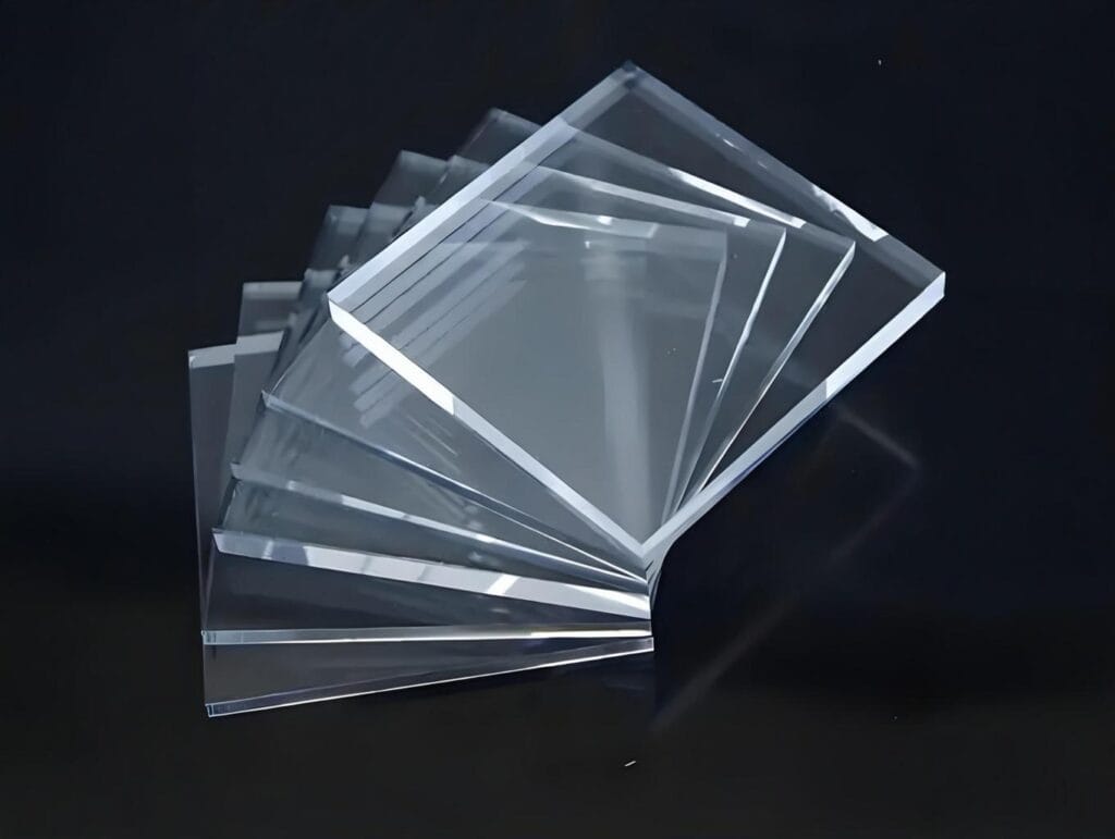
For example, printing on white acrylic may produce brighter colors than printing on transparent acrylic or dark-colored surfaces. Glossy materials can also make colors appear more vivid, while matte surfaces may reduce their visual intensity.
Material characteristics that influence color reproduction include:
- Base color of the substrate
- Surface gloss and texture
- Ink adhesion and surface treatment
- Light reflection and transparency
For transparent or dark materials, white ink can be used as an underbase to improve color visibility and opacity.
4. White Ink Settings Affect the Final Colors
White ink plays an important role in UV printing, particularly when printing on colored, transparent, or dark materials.
Without a suitable white ink layer, CMYK colors may appear transparent, weak, or significantly darker than expected.
However, too much white ink or an unsuitable printing sequence can also affect the final appearance.
Check the following settings:
- White ink density
- White underbase configuration
- Printing sequence
- White ink layer thickness
- Whether a white overprint layer is required
Adjusting these settings according to the substrate can improve color strength and consistency.

5. Monitor Calibration and Brightness Can Be Misleading
A computer monitor that is too bright may make a design appear more vivid than the actual printed result.
This is especially noticeable when customers approve artwork based only on digital previews.
For more reliable color evaluation:
- Calibrate the monitor regularly.
- Use a consistent screen brightness.
- Avoid judging print colors under different lighting conditions.
- Compare printed samples under standardized lighting where possible.
A calibrated monitor does not guarantee an exact screen-to-print match, but it reduces unnecessary differences during artwork preparation.
6. Printer Calibration and Ink Conditions Matter
Even with correct artwork and color profiles, printer conditions can influence the final result.
Changes in printhead performance, ink circulation, nozzle condition, and ink supply may cause color inconsistencies.
Before adjusting the artwork, check:
- Printhead nozzle condition and missing nozzles
- Ink levels and ink quality
- Printhead alignment
- RIP color management settings
- Print mode and resolution
- Printer calibration status
Regular maintenance and consistent printing conditions help maintain stable color output between jobs.
7. Print a Color Test Before Production
For important orders, especially those involving brand colors or repeat production, a test print is more reliable than judging the design on screen.
A practical workflow includes:
- Prepare the final artwork using the agreed color profile.
- Select the actual printing material.
- Configure the appropriate ICC and white ink settings.
- Print a small color test.
- Compare the result with the approved physical sample.
- Adjust the settings before starting full production.
For repeat orders, keeping the original RIP settings and physical color samples can help reduce variations between batches.
How to Get More Consistent UV Printing Colors
Screen-to-print color differences are a normal challenge in digital printing. The key is to control the entire workflow rather than adjusting only the design file.
Use consistent color profiles, calibrate the printer and monitor, select suitable ink settings, and test the actual substrate before production.
For UV printer buyers, color management capabilities, RIP software compatibility, white ink control, and stable ink delivery are important factors to consider when selecting equipment.
If color accuracy is important for your application, discuss your materials, artwork requirements, and expected print results with your UV printer supplier before purchasing.